
03 Apr Dashboards and Visualisations: Why are pie charts bad?!
Friends Don’t Let Friends Use Pie Charts!
by Dr Rob Meredith, Principal Information Management Consultant
Effective data visualisations improve understanding and can lead to better decision outcomes. Creating good visualisations is hard though, and for many information professionals, we have zero training in doing it, let alone doing it well. Consequently, we often end up with data visualisations that obfuscate rather than inform, and we’re awash with that middle-management scourge: the pie chart.
What do you mean? I love pie charts! You’ll take them from my cold dead hands.
A good data visualisation can be a powerful thing – it can literally change the world for the better. John Snow’s geospatial visualisation of an 1850s London cholera outbreak was central in establishing germ theory and modern approaches to sanitation and public health – billions of lives have been saved or improved as a result. Florence Nightingale, the founder of modern nursing, also used data visualisations to convince policy makers of the need for a new approach to hospital care. Some argue that she essentially invented the pie chart (so how bad can they be??)

Figure 1 – Dr John Snow’s Cholera Map
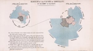
Figure 2 – Florence Nightingale’s ‘Rose’ or Coxcomb Diagrams
That power to persuade is most effectively realised, though, if the data visualisations are well-designed communication tools. Poorly designed, complex visualisations can get in the way of telling the story of the data by forcing the audience to work harder than they should have to. At worst, they mislead.
“You want the audience to spend cognitive effort on understanding the data and what it means, not on understanding your chart.”
But everyone understands pie charts!
Maybe. But are they as easy to understand as other visualisation choices? Here’s where we get into a bit of cognitive science.
What we perceive as reality is stitched together from filtered sensory input overlaid with memories and our understanding of the world. Broadly, processing of sensory input goes through two different kinds of processing: fast, low-effort, heuristic-based ‘pre-attentive processing’, and slower, cognitively-intense ‘attentive processing.’

Figure 3 – Pre-attentive and Attentive Cognitive Processing
Pre-attentive processing can very quickly interpret sights and sounds and focus our attention on ‘anomalies’ in the environment like changes in shape, colour, alignment, orientation, length, or motion. This processing happens sub-consciously: it’s fast and low-effort.
Attentive processing is where we apply reasoning and conscious effort. It’s slower, but more powerful, allowing us to understand our environment more deeply and derive meaning from it.
Understanding these two different kinds of processing can help us understand why some data visualisations are better than others, particularly where we want the audience to compare information. The more we play to the strengths of pre-attentive processing, the less effort is required and the less there is to compensate with attentive processing. The figure below shows how much easier some tasks are if we leverage this:

Figure 4 – How Many 5s Are There? A Comparison of Pre-Attentive and Attentive Processing Effort
Pre-attentive processing is great at comparing straight lines, alignment, lengths, colour, and clustering. It can even fill in blanks. However, it’s not very good at comparing curves or areas, especially when the shapes are not lined up evenly. It’s terrible at comparing angles.
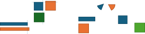
Figure 5 – Comparing lengths and alignment (L) is easy. Comparing areas (R) is hard
Guess how well pie charts fare, with data encoded in curved areas and angles, all arranged in a circle.
Exactly.
Pie charts make us work hard, forcing the attentive processing part of the brain to both understand the chart and understand the data. It’s worse when there is more than a handful of data points, and really bad when multiple pie charts are used to provide comparisons in a dashboard layout.
And no, donut charts are no better.
“Pie charts are almost always no better than alternative visualisations, and most of the time are far worse.”
Fine. How do I make good, easy to understand data visualisations?
Less is more. Less also takes hard work.
A good place to start is the aesthetically beautiful but informative work of Edward Tufte. And if you’re looking to design dashboard-style visualisations, read Stephen Few.
Use straight lines, alignment, and meaningful colour to do the heavy lifting. Avoid 3D effects and other unnecessary graphical elements. These can include axis lines, unneeded text or use of colour that has no meaning. Tufte coined the phrase ‘chart junk’ to refer to elements that don’t communicate data, recommending the maximisation of the ‘data-to-ink ratio’.
There are exceptions to every rule – the field is currently more art than science, although this is changing. But broadly, follow these steps to create better visualisations:
- Let the data tell the story. Know your audience and the story to be told, and trust the data to grab attention, not the bells and whistles of your charting tool.
- Leverage pre-attentive processing as much as possible. Use colour carefully. Consider placement and alignment to make comparisons easy and draw attention to anomalies.
- Avoid non-linear, curve-based comparisons or projections. We’re really bad at it.
- Resist the urge to add special effects of any kind. If any are used, be very clear about why you’re using it and how it makes the story in the data easier to understand.
- Practice data honesty. Don’t mislead or obfuscate with choice of chart type, scale, sample etc.
Where can I find out more?
People
• Edward Tufte – http://edwardtufte.com
• Stephen Few – http://perceptualedge.com
• Hans Rosling (use animation to tell the data story): TED Presentation.
Short reads
• Three Questions to Ask Yourself Next Time You See a Graph, Chart or Map
• Here’s Why You Should (Almost) Never Use a Pie Chart for Your Data
Blogs
• Juice Analytics – http://www.juiceanalytics.com/writing
• Darkhorse Analytics – http://www.darkhorseanalytics.com/blog
• Flowing Data – http://flowingdata.com
• Storytelling with Data – http://www.storytellingwithdata.com/blog
• Visualising Data – http://www.visualisingdata.com/blog/
Academic Work
• Journal of Computational and Graphical Statistics
• Many books (see Google Scholar, search for ‘data visualization’)
Learn more:
Client Story: Dashboards for a Financial Institution